Услуги
Сочетание стратегии, дизайна и технологий для создания брендов завтрашнего дня.
Why a design system is essential.
Design systems are often the unsung heroes of the products we use every day—from mobile apps and websites to the interfaces on television screens and car dashboards. They serve as the DNA for product design and development, encoding the principles and elements that define the very experience users interact with. Colors and icons convey meaning. Buttons are implemented with a consistent size and shape. Language is clear and understandable.
Without a design system, you may find yourself in a crisis of inconsistency — navigating a maze where every turn could lead to confusion, brand dilution, or user frustration. In this series, we’ll walk you through the basics of design systems, dissect what makes them so essential, and guide you through crafting one that not only elevates your digital presence, but also protects it against the spread of design disarray.
Advantages of a design system.
Faster innovation. The system is easily configurable for future iterations, the main advantage is the ability to change multiple linked elements with a single click.
Scalability. Scale design system as your product grows. Powerful capabilities, like variable modes, help you scale across use cases, themes, and more.
Consistency. Maintain your product’s look and fee across different platforms. Create shared assets and libraries that the whole team can access.
Optimisation. The system bridge design and development by housing technical specs, code snippets, and documentation that transform design intent into implementation reality.
What does Figma file include?
Style Guide — maintains consistency of visual style. These set the visual language, including the appearance of elements and the overall voice and tone of the product. The guide page contains typography rules and heading styles, color palettes, effects, grids, indents, icons, and illustrations. The corresponding file settings create a library of local styles, preventing the haphazard addition of external styles and make instant changes throughout the system.
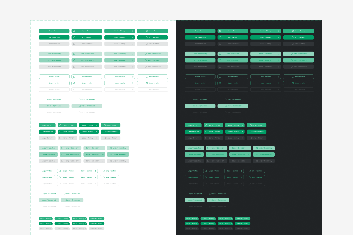
The component library — a key tool for fast updates. This is reusable elements and interaction patterns that inform the common interface and behaviors of your product. It can include components, layouts and interaction patterns. Components are reusable elements such as buttons, input fields, or icons. They are the building blocks that allow you to create a consistent and scalable design by combining them. The key benefit is the ability to make a single change to the main component, which will automatically apply to all its copies in the file.
Principles and professional standards supported by the system.
Responsive auto-layouts. When editing elements and layouts, they are automatically aligned according to the parameters set in the system. This eliminates chaotic placement of elements and speeds up work.
States for elements. The system takes into account the states for components, such as enabled, disabled, hover, and focus, which communicate the element’s current status to the user. It also includes screen-level states like loading, empty, and error states, which describe the overall condition of the application or page.
Different themes or modes. The ability to create different themes and seamlessly switch between them — light and dark themes, language and text themes, themes for different brands, themes for different screen sizes. For example, light and dark themes are a requirement for app stores, they allow for the user’s device settings to be taken into account.